Client
CP Foods
 Contact Us
CP Foods is one of the most trusted names in protein — but on a crowded supermarket feed, trust isn't enough to stop a thumb mid-scroll. Every post competes with friends, memes, and a dozen brands shouting "promo." We built the creative system that earns the tap.




CP Foods is one of the most trusted names in protein. But trust doesn't automatically survive the scroll — on a supermarket feed, every post competes with friends, memes, and a dozen brands all shouting the same promo.
Bungeee Digital had the media strategy handled: the right audience, the right placements, the right spend. What they needed was creative that could close — assets that stop the thumb and earn the tap once the impression is served. Since January 2026, Glyde has been CP Foods' creative engine, producing 50+ statics, carousels, and reels on a single, repeatable design system.
Why most food feeds fail.
A packshot on a coloured background is not a campaign. Across most FMCG feeds, the same problems quietly leak brand equity.
Product colour drifts post to post. Nothing feels like it came from the same brand.
Assets get produced, but nothing anchors them to a clear objective or product story.
Creative that doesn't speak to who's actually scrolling — or what would make them stop.
When every post looks like a different brand, recognition breaks down. Equity — and trust — needs repeatable visual rules.
Bungeee brought the brief and the media. Glyde built the creative system that made it perform.
The Glyde design system: four pillars.
A repeatable set of rules that made every asset feel like CP Foods — and made every asset work harder on the feed.
Every asset ties back to the brief: correct product, correct claim, correct link. No drift.
Formats built to stop the scroll, not just fill the grid — hook-first thinking applied to a static feed.
Craveable motion that makes the product the hero and makes people hungry.
Every asset lives in the safe zone. Claims stay legible, packshots stay craveable, nothing critical gets cropped at thumbnail size.
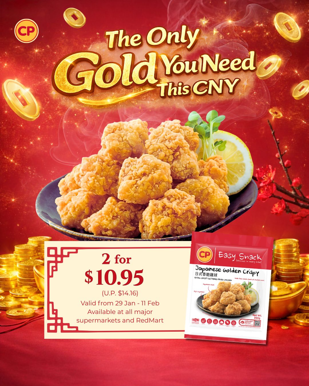
Hook-first thinking on a static feed, appetite-first motion in the reels — one system holding both together.
The feed, as it ran.
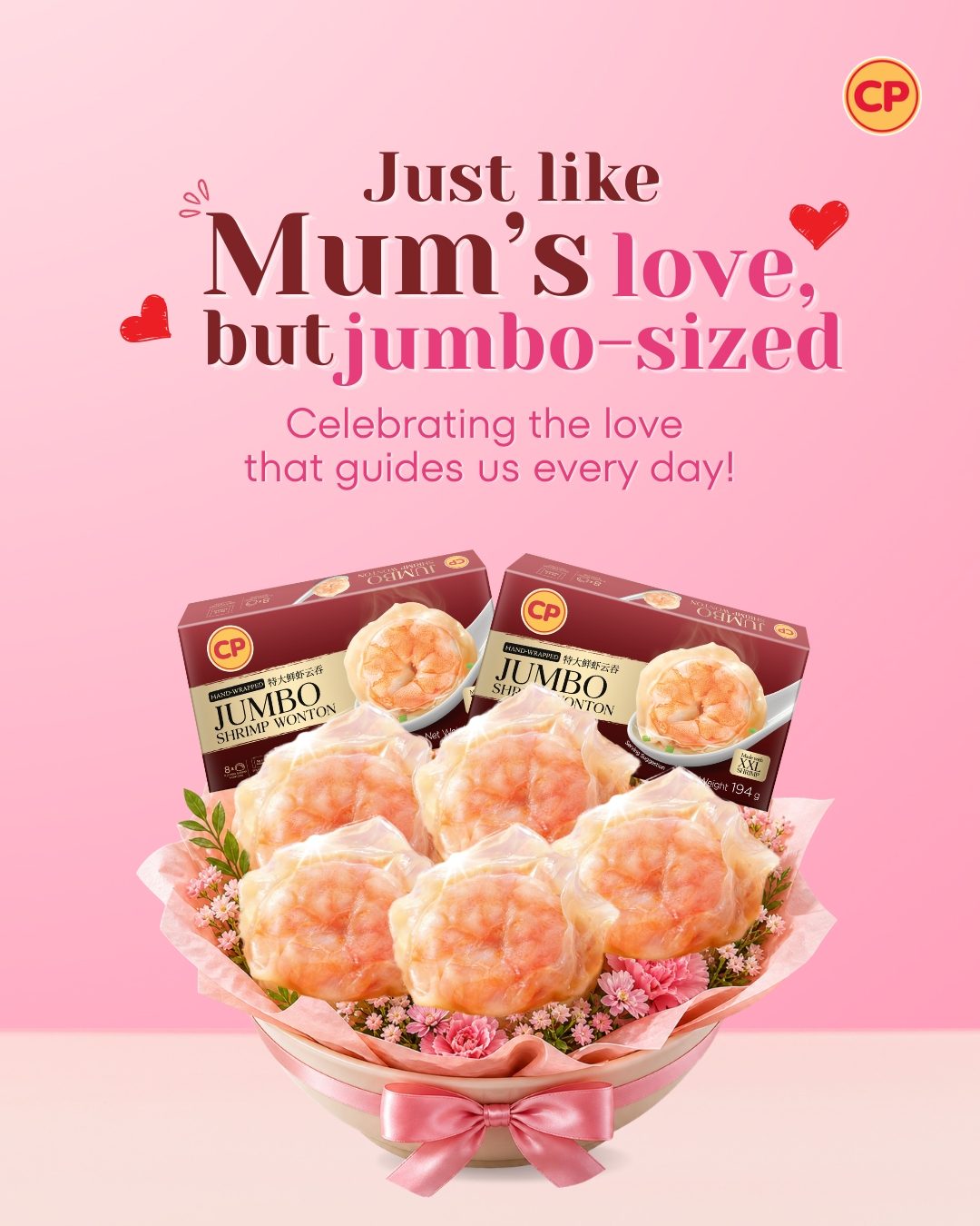
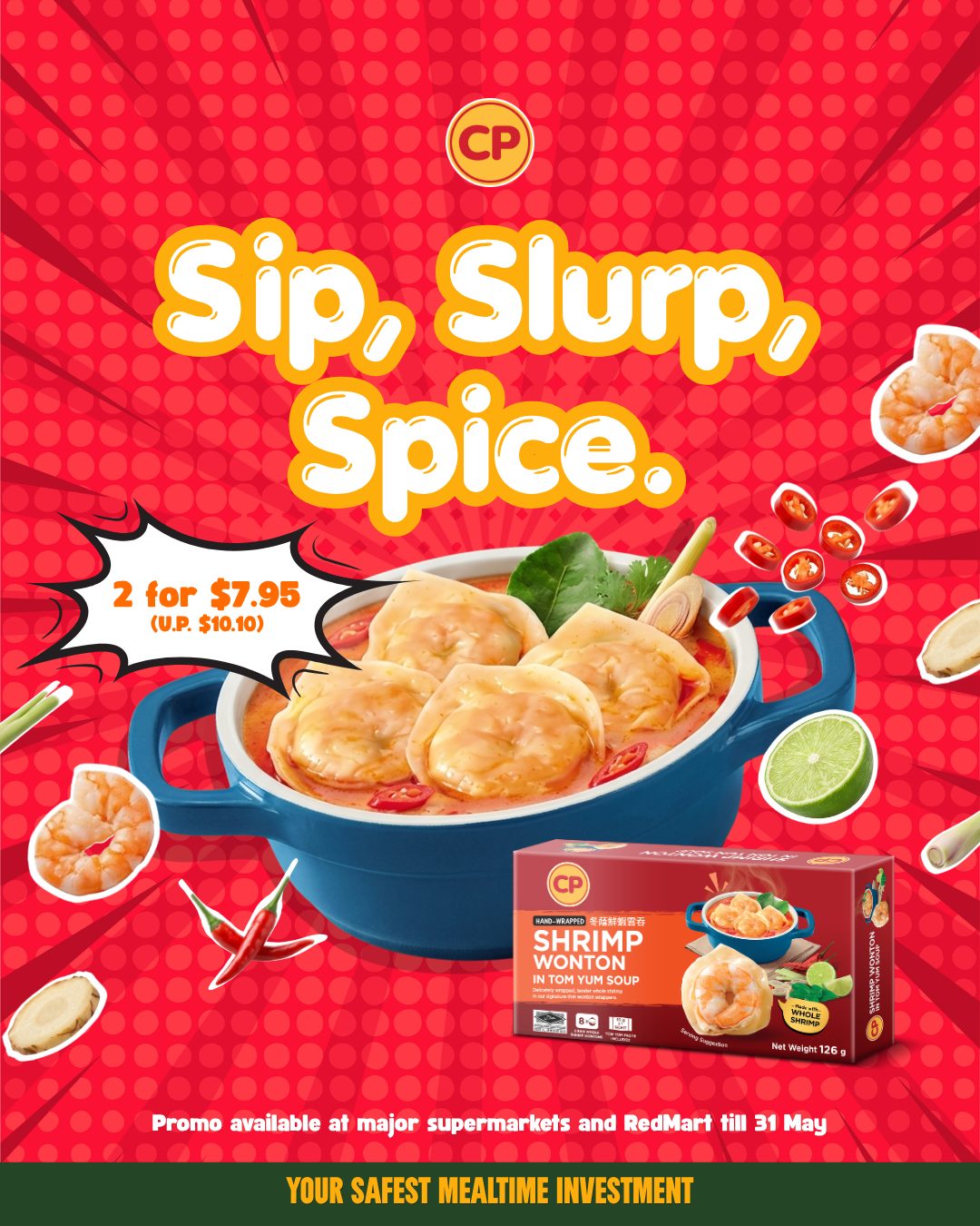
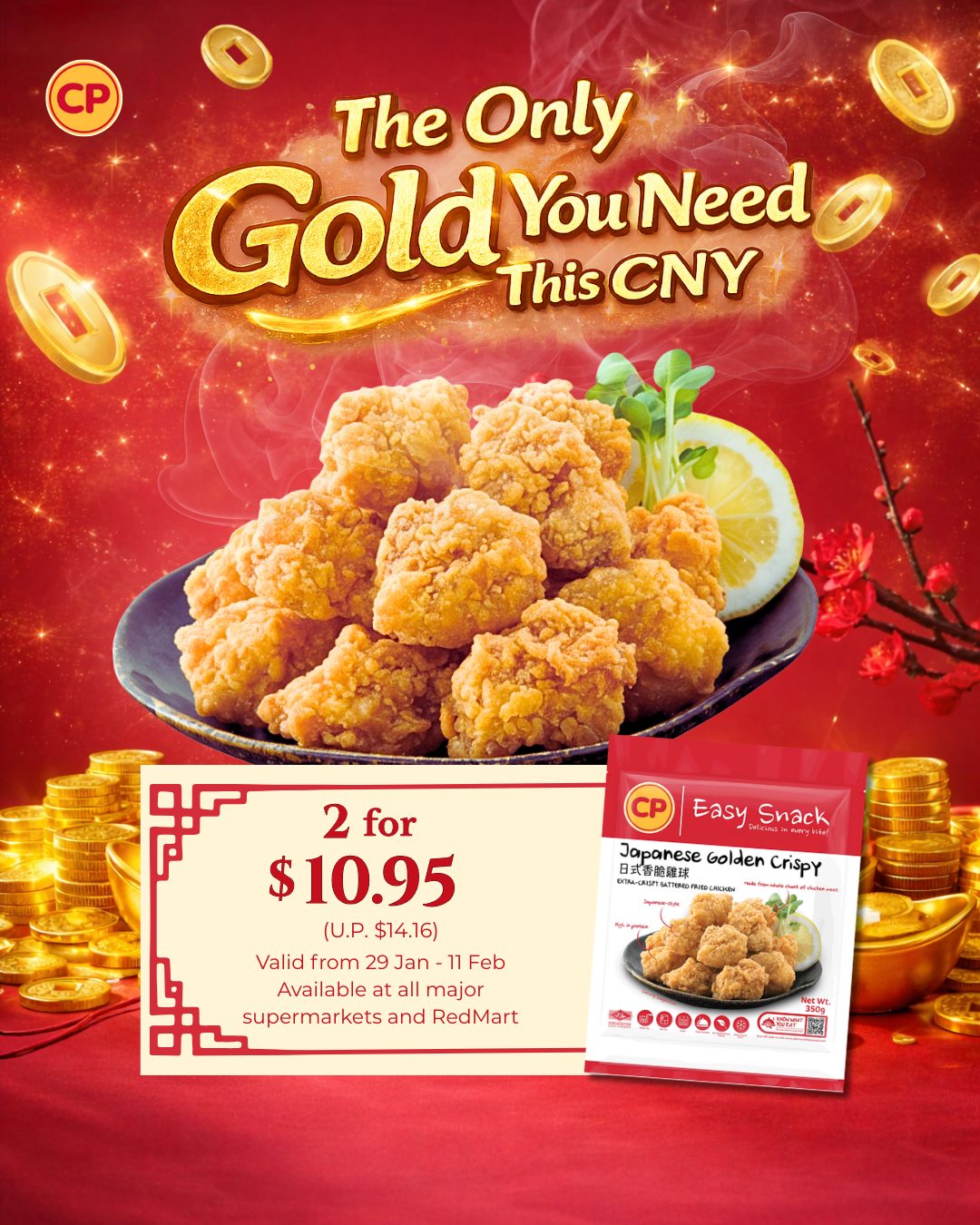
A six-month run of campaigns across CNY, product launches, and always-on content — jumbo shrimp, golden crispy, tom yum, gyoza, Korean crispy mandoo, stewed pork, rendang & satay, wonton, and more. One system, one recognisable brand, every post.
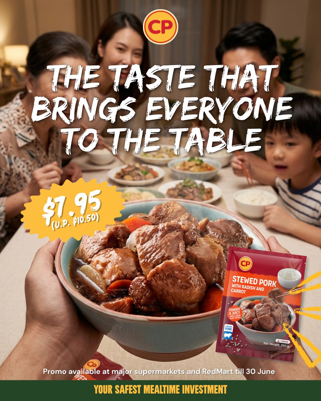
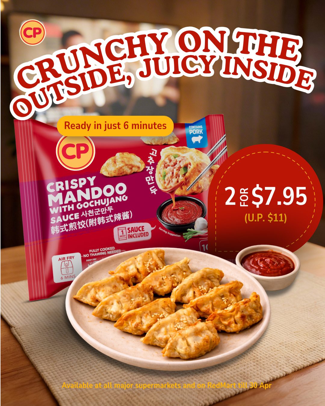
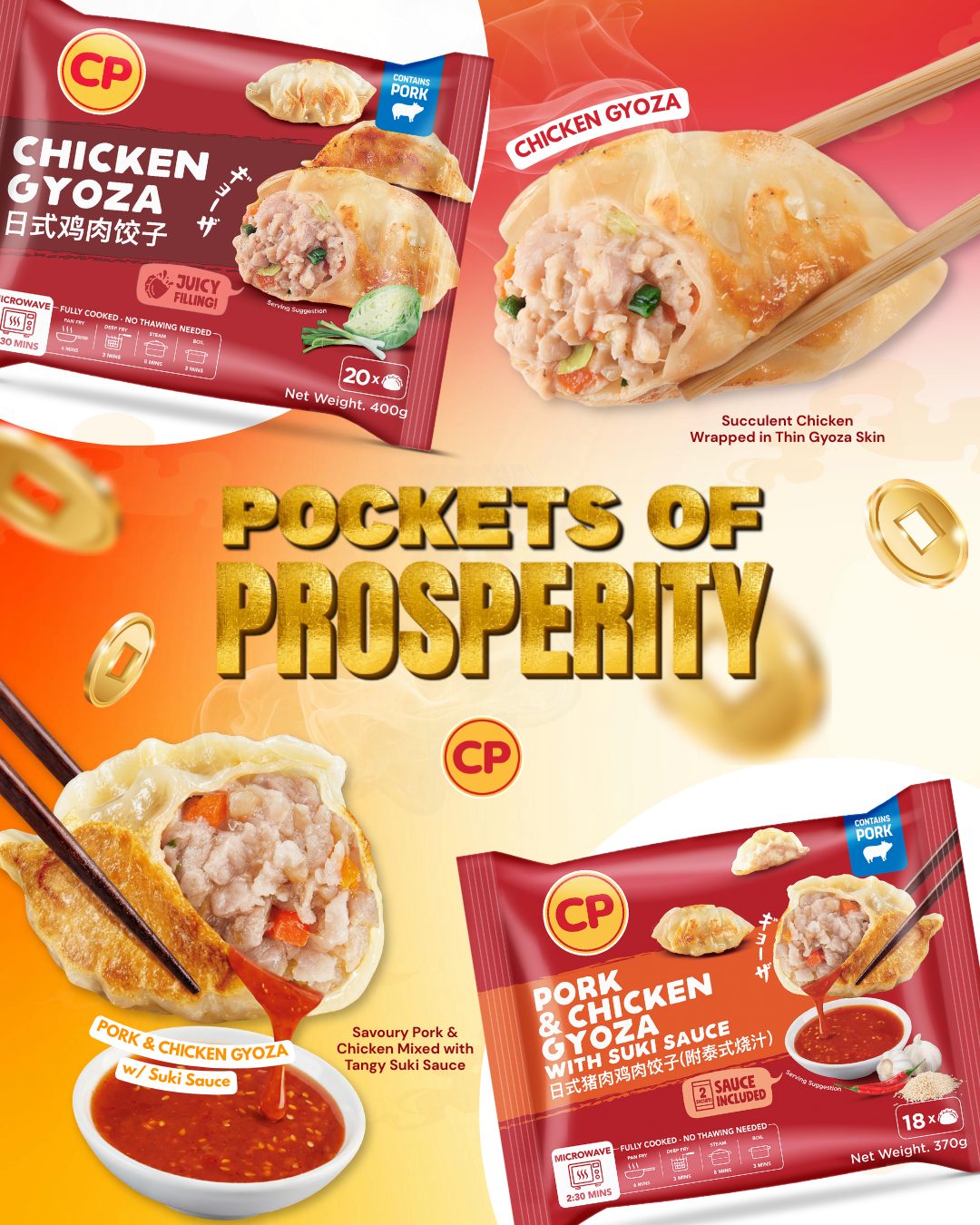
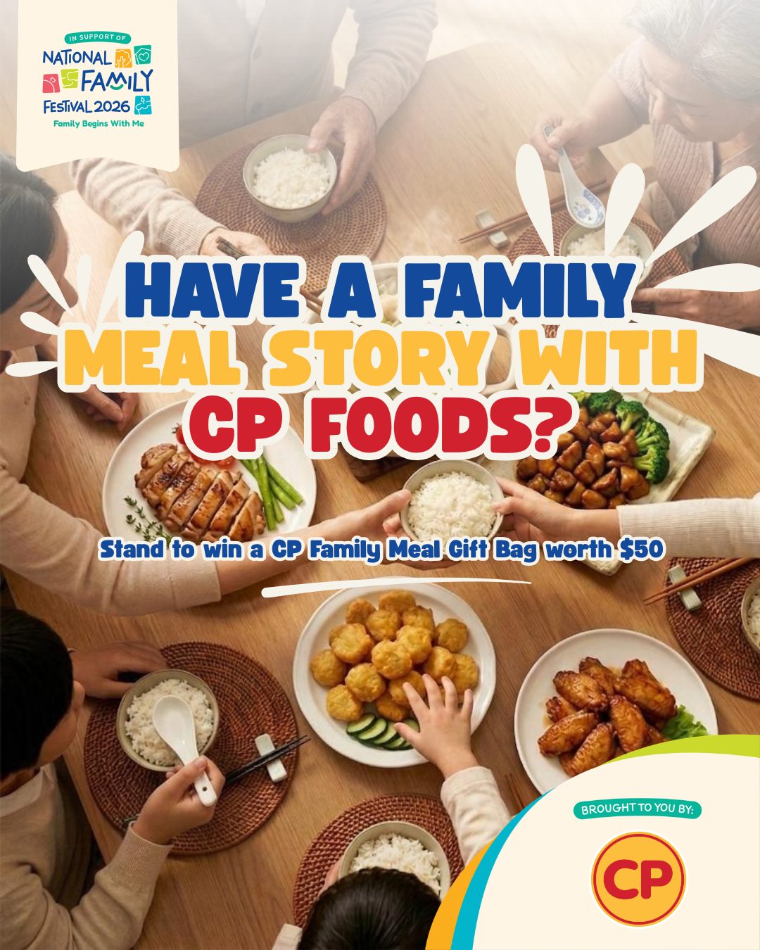
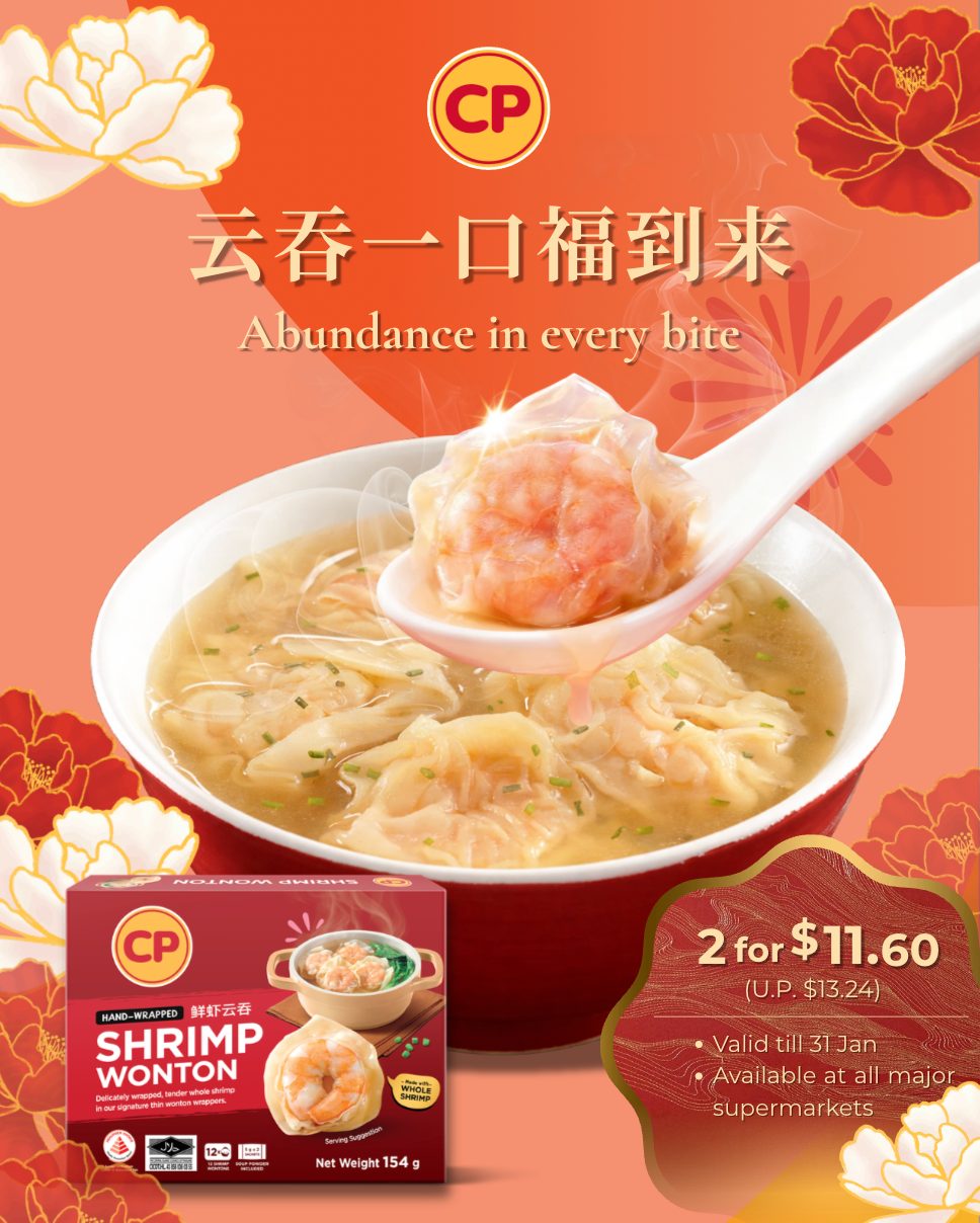
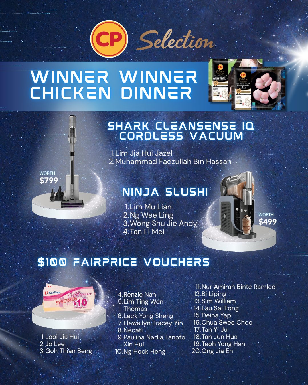
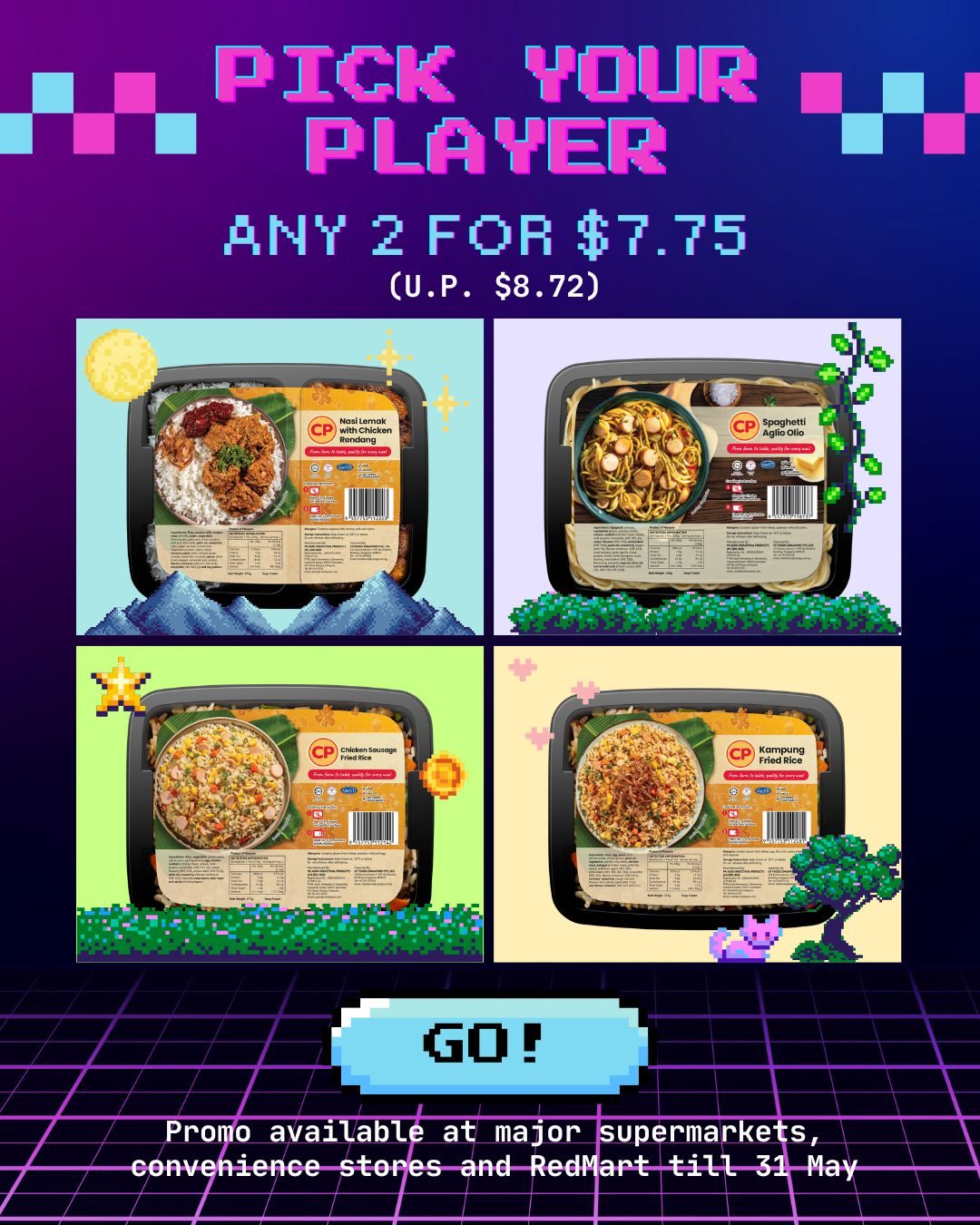
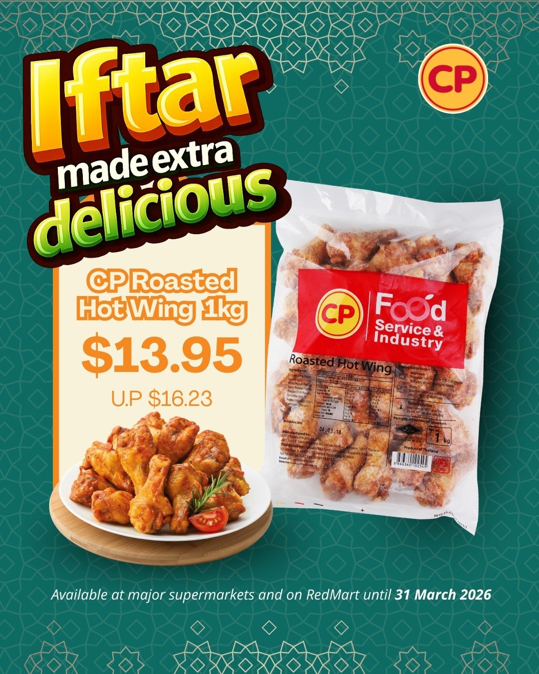
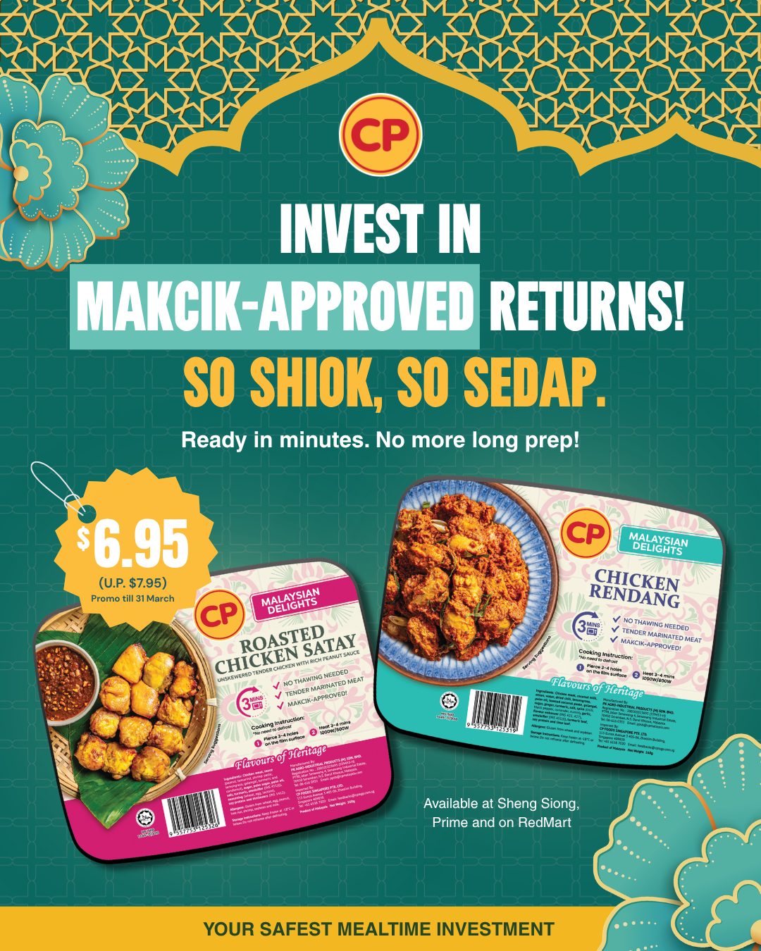
We sell the one thing that matters. Then bring the community along.
One benefit, one hero shot. The packshot stays craveable, the claim stays legible at thumb size, the colour always matches. Nothing competes with the sell.
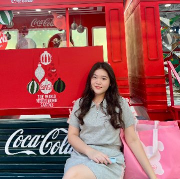
The School Holiday Survival Kit carousel reframes CP products inside a teen's actual day. Giveaways and collabs close the loop — reward the audience, feed the next campaign's reach.
Every static and reel is built to stay visible and readable wherever it lands. If the audience can't read it at a glance, it doesn't ship.
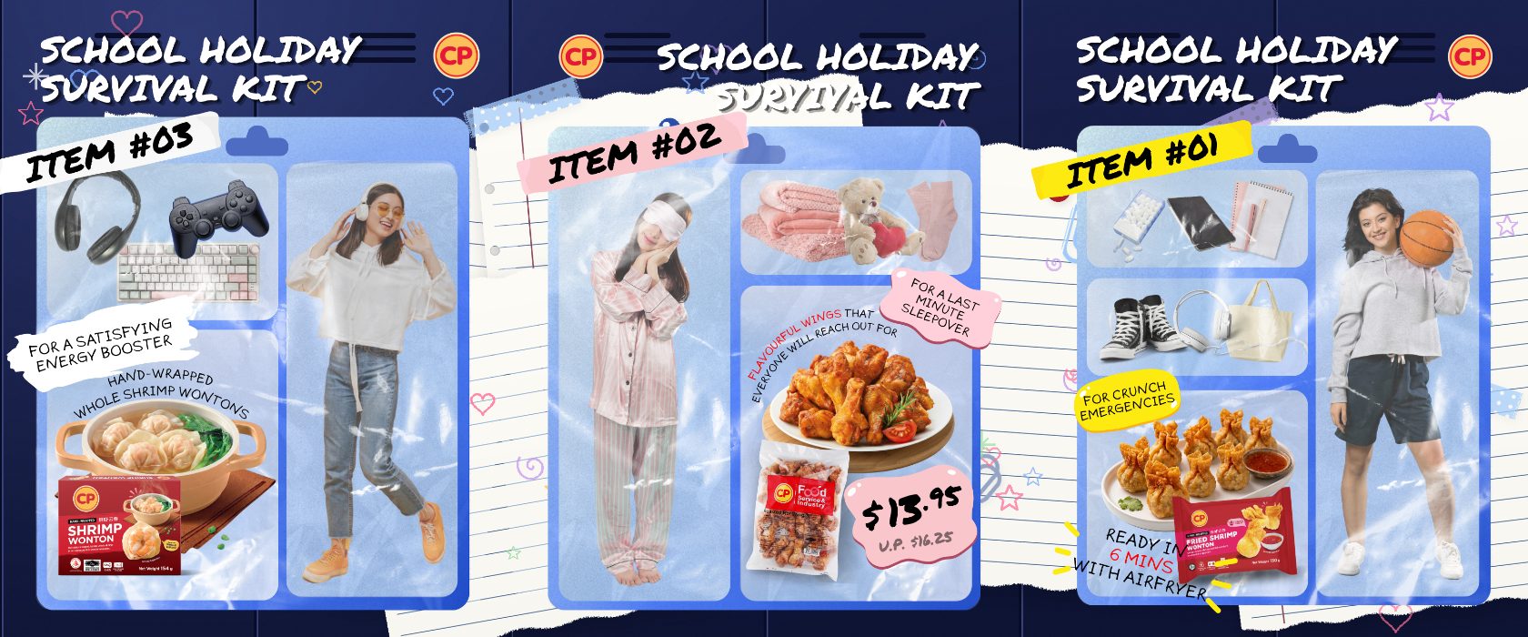
The School Holiday Survival Kit carousel — swipeable frames that reframe CP products inside a teen's actual day: gaming, sleepovers and crunch emergencies.
If great media is finding your audience but the creative isn't closing — that's our lane. Let's build a feed that performs.