Client
First Ambulance Services
 Contact Us
Malaysia's most-trusted private EMS provider had the reputation. We gave it the website to match — one that surfaces critical, life-saving services in seconds and reads as reliably as the crews behind it.
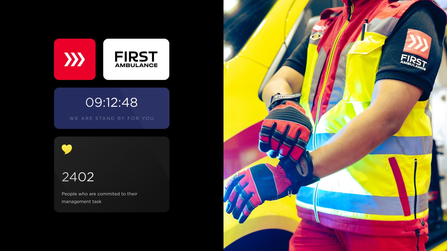
First Ambulance has answered Malaysia's emergencies since 1997 — 25+ years on the road and a 53% share of the country's private hospitals. The reputation was there. The website wasn't.
Over six weeks, we took the brand from dated to definitive: mapping a complex, five-division operation into a clear structure, designing an interface built to earn trust fast, then hand-building the whole thing in Webflow.
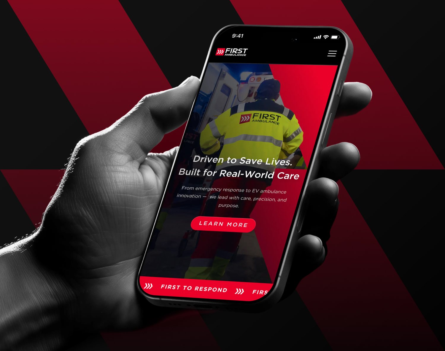
The redesigned First Ambulance — serious, modern and human, built around the crews who show up when it matters.
First Ambulance had the reputation — 25+ years of leadership and half of Malaysia's private hospitals on its books. What it didn't have was a storefront that said so.
The old site was slow to navigate and vague about what the company actually offered. A market leader was being mistaken for a small operator. And in a category where hesitation costs lives, the website had one job it wasn't doing: communicate critical services instantly, and feel as dependable as the crews on the ground.
Urgent contact and core services were buried. They needed to surface on sight — not three scrolls down.
Five divisions and multiple audiences — hospitals, patients, partners, recruits — funnelled through one unclear structure.
The brand needed clinical authority without feeling clinical — serious, modern, human.
Design and a fully built, responsive Webflow site — shipped on a tight timeline.
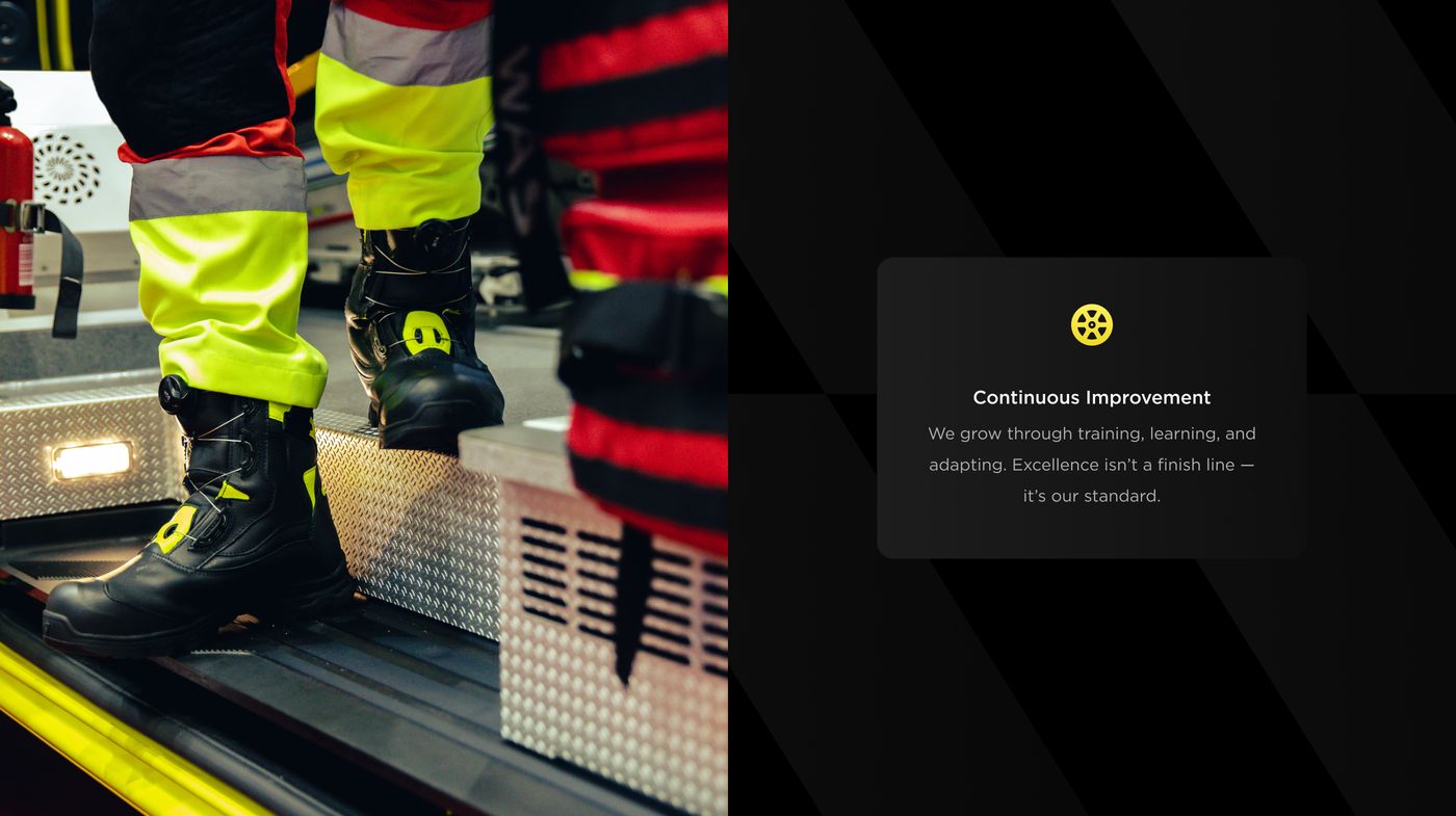
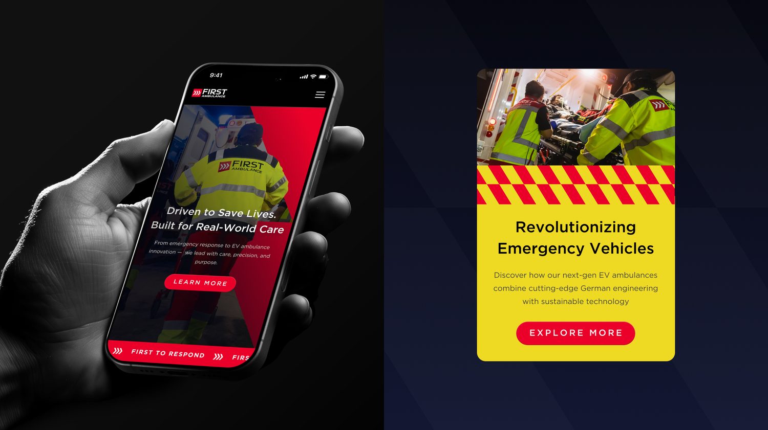
Real crews, real readiness — the operational world Ghoni built the new interface around.
We started where the confusion lived: the structure.
Before designing a single screen, Ghoni mapped the entire operation into a clear sitemap — separating Company, Innovations, Commitment, Careers and Press so every audience has an obvious path, with a persistent safety layer so help is never more than one tap away.
Step 01 — Glyde's information architecture. Clear divisions mapped to real audiences. Order before pixels.
With the map drawn, the work was planned as a tight, honest sequence — discovery, wireframing, UI, refinement and build — so a full site could ship in six weeks without cutting the strategy.
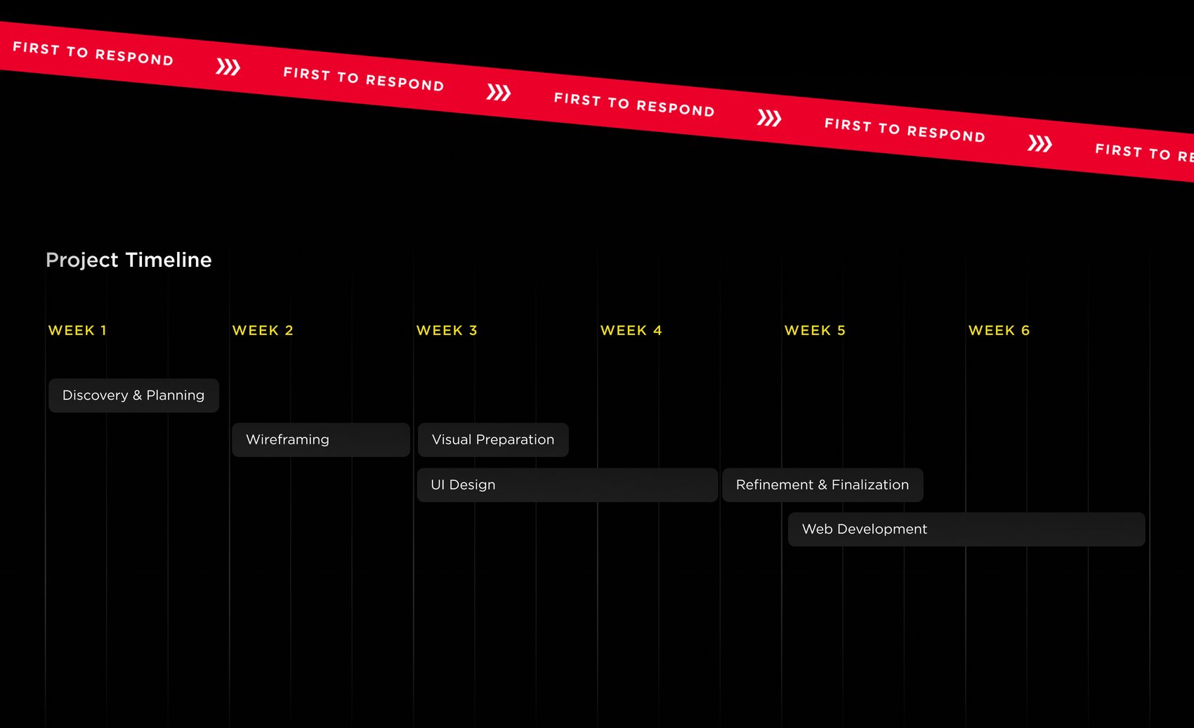
The six-week plan — overlapping tracks that kept design and build moving in lockstep.
Then he designed the interface around two feelings: speed and reassurance. The emergency number never hides. The hero states the mission in a single line. Service cards explain what First Ambulance actually does — before you scroll.
A dark, confident palette with sharp Emergency Red signal accents reads as serious and modern: clinical authority you can feel. Set in Gotham, with Safety Yellow and Rescue Navy as support, it turns urgency into a system.
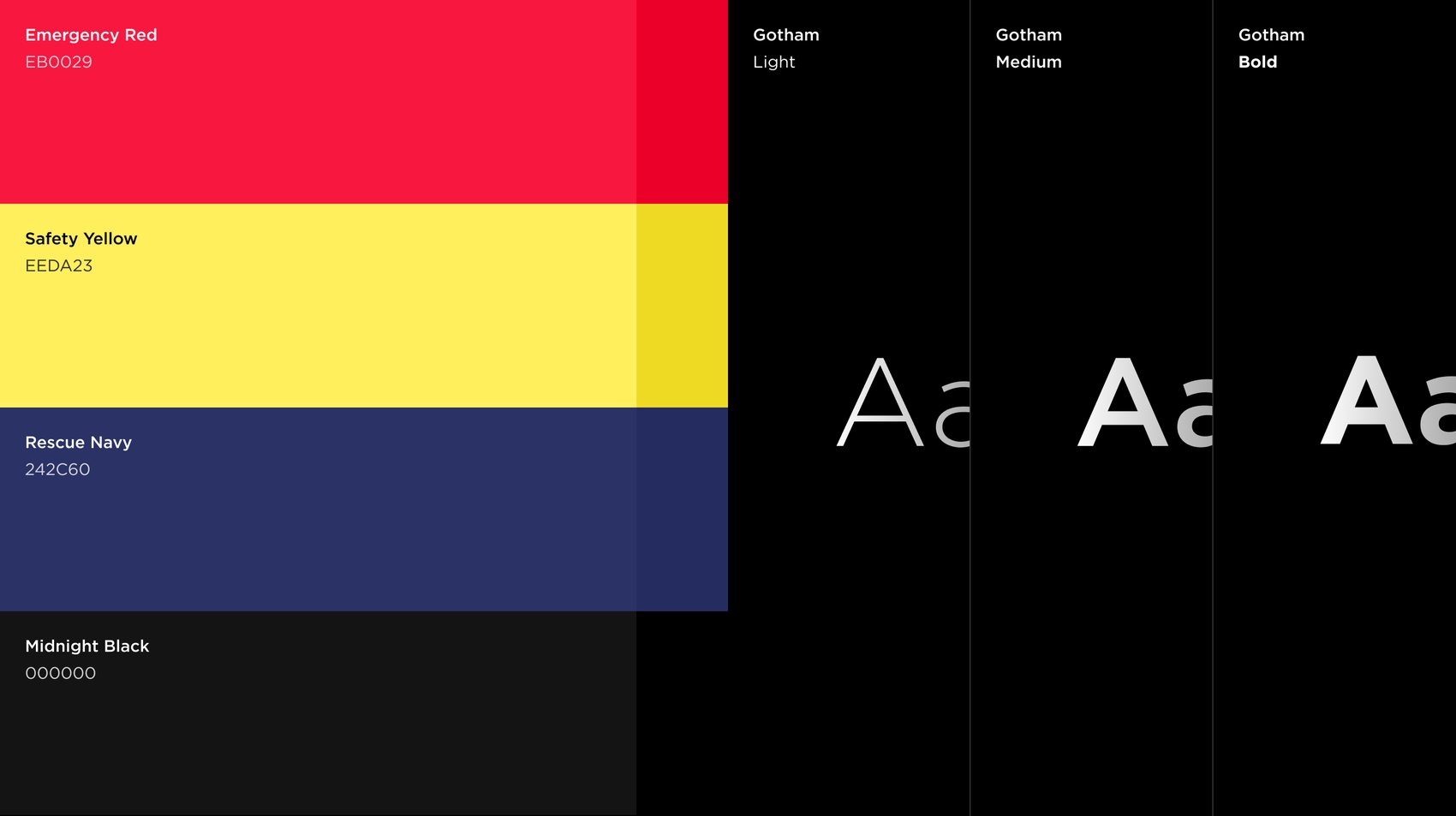
The system — Emergency Red for signal, Safety Yellow and Rescue Navy for support, Gotham for a voice that's clear under pressure.
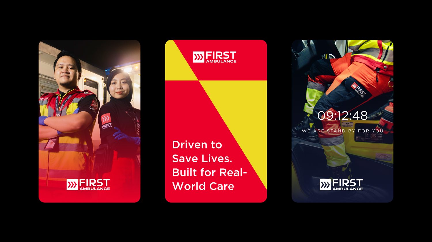
The brand world — real people and live readiness, tuned to feel dependable rather than corporate.
A complete sitemap before a single pixel — five divisions mapped to five real audiences.
The emergency line and core services sit above the fold and stay one tap away, everywhere.
A dark, precise UI with red signal accents — modern credibility that still feels human.
Hand-built in Webflow by Ghoni: responsive, fast, and ready to scale with new divisions.
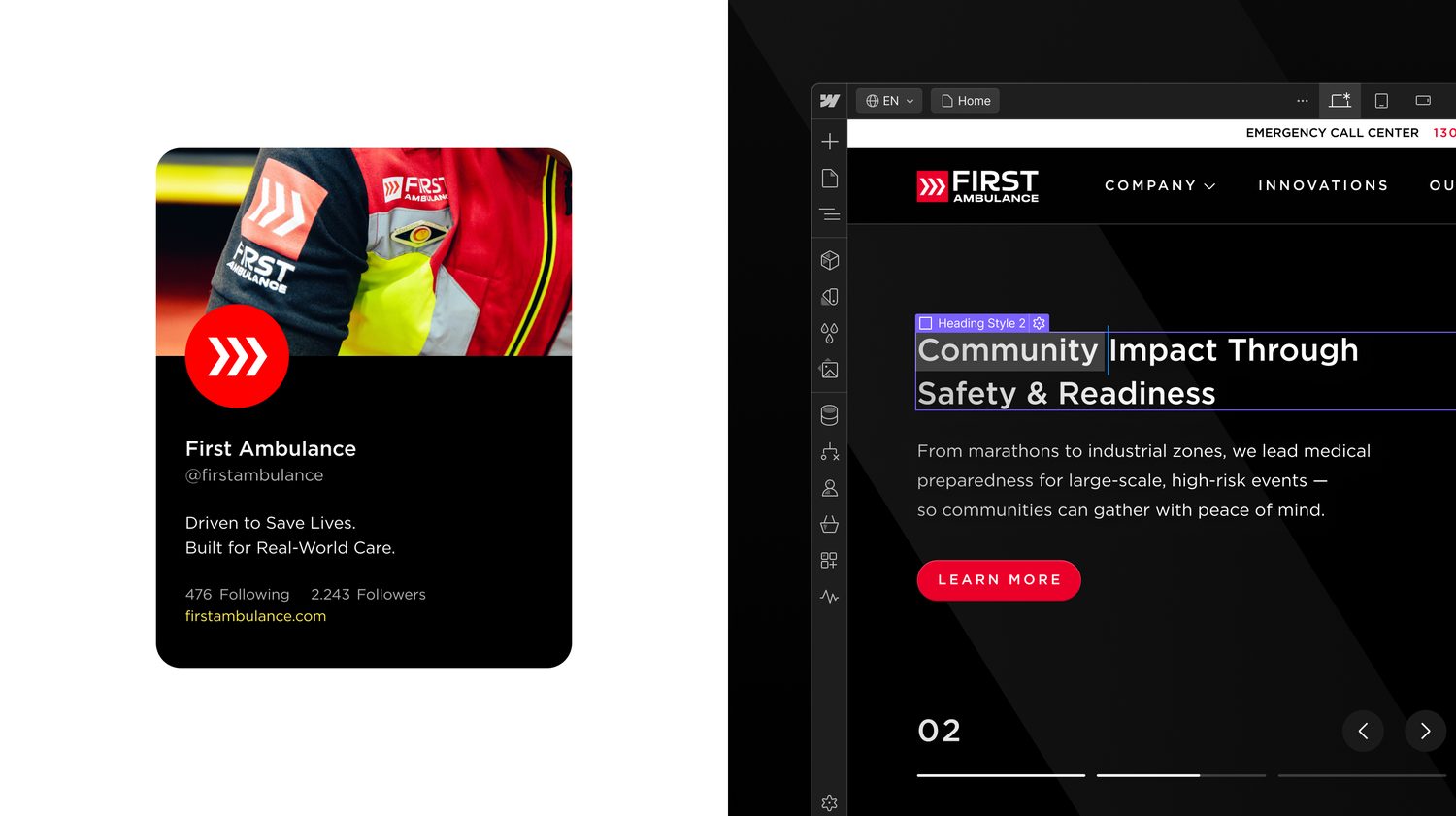
From mockup to live build — Ghoni carried the full system into Webflow himself, editing content and structure hands-on.
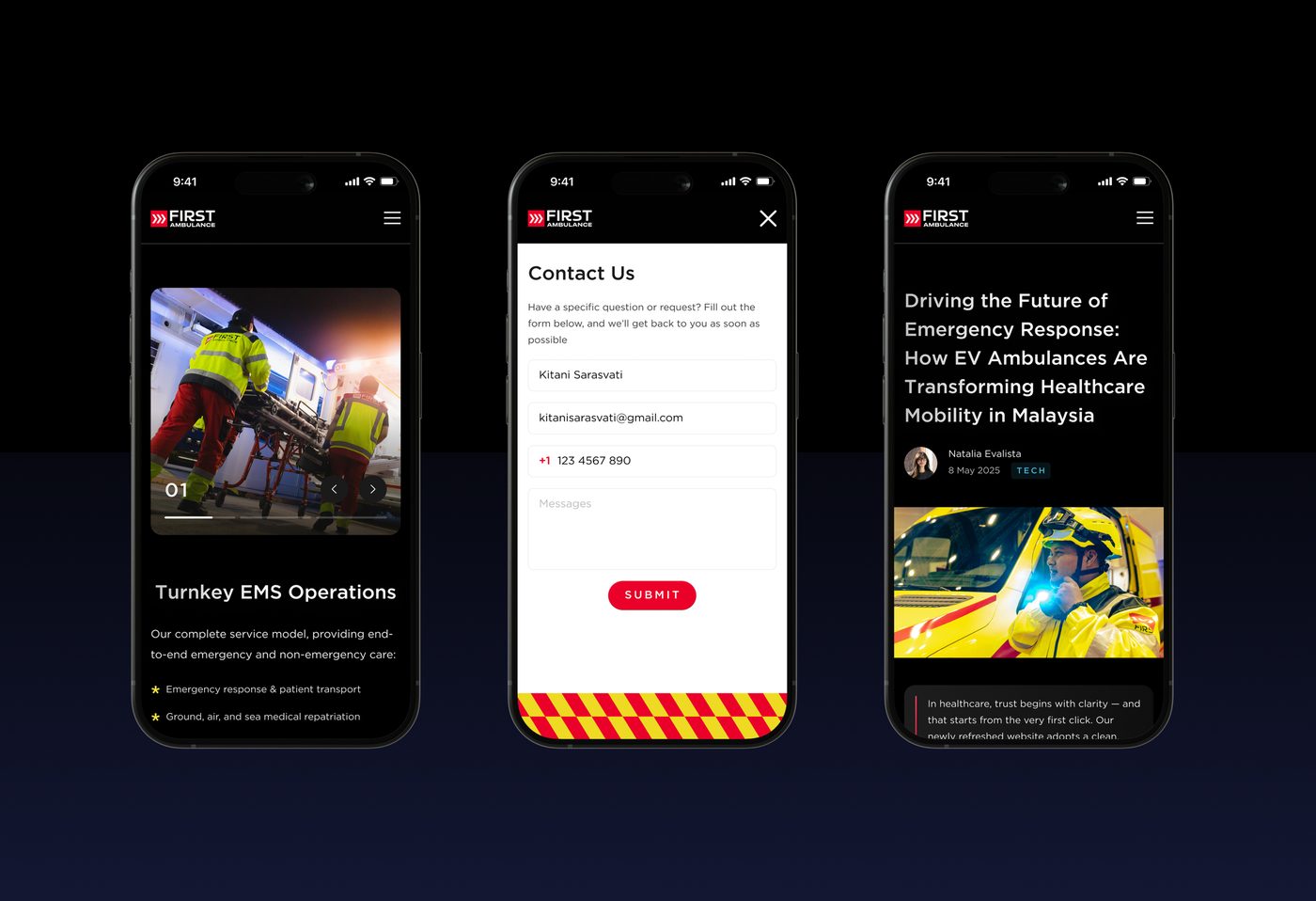
Responsive by default — services, enquiry and a live press feed hold up cleanly on mobile, where most emergencies start.
In an emergency, the website has the same job as the crew: arrive fast, and be impossible to doubt.
A website that finally matches the operation behind it — clear, credible and quick.
Visitors reach critical services in seconds. Partners see a market leader. And First Ambulance has a digital front door built to scale with new divisions and innovations like its EV ambulance fleet.
Five divisions and a live press feed — every audience on a path of its own.
Critical contact & core services — help is always one tap away.
Reflects 25+ years of EMS leadership, without feeling cold.
Designed and built in Webflow — responsive and ready to grow.
Tell us what you're building — we'll show you how we'd structure, design and ship it.