Client
HangNOver
 Contact Us
Korean-made hangover recovery, reimagined for the Vietnamese market — repositioned from a pharmacy remedy into a confident lifestyle brand, with a full identity and packaging system built to own the shelf.

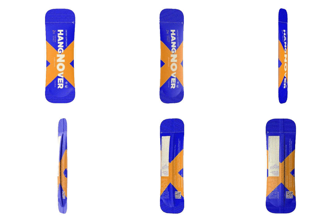
HangNOver is a Korean-made hangover-recovery supplement developed for the Vietnamese market. The founders approached Glyde Studios with a clear goal: create a brand that could stand apart from traditional pharmacy-style remedies while staying credible, functional and commercially viable.
We led the project end to end — from positioning and naming through visual identity and production-ready packaging — building a brand designed to own a crowded convenience-store shelf.
The Vietnamese hangover-recovery market presented several challenges. Most competitors occupied the same space — functional-first, medicinal-looking and pharmacy-oriented, with limited emotional appeal. The result was a crowded landscape where products looked interchangeable and struggled to build any real brand affinity.
The audience skewed toward young working professionals — particularly women — who wanted recovery solutions that fit naturally into their lifestyles. The brand had to feel premium and desirable without losing clinical credibility.
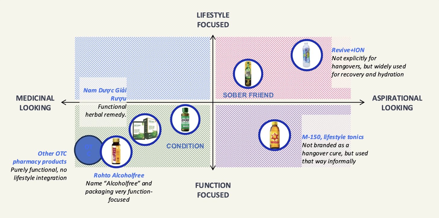
Mapping the category — most rivals cluster in the medicinal, function-focused corner, leaving the lifestyle-aspirational space wide open.
Competitors were functional-first and medicinal-looking. Everything on the shelf blurred together.
The brand had to feel modern and aspirational while keeping real, believable recovery benefits front and centre.
Young professionals — especially women — who party hard and still crush the 9 AM meeting.
A complete identity and packaging system, concept to production, without compromising the strategy.
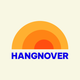
The identity: a custom sunrise “O” and a royal-blue & mango-orange palette designed to stand out in a sea of muted, medicinal packaging.
We began with a positioning exercise across the Vietnamese recovery and wellness market. Rather than competing head-on with medicinal brands, we found an opening in the space between a night out, professional ambition and credible recovery — a product that fits the morning after, not the medicine cabinet.
That idea became the foundation of everything: the bright, on-trend recovery boost for professionals who party hard and still crush the 9 AM meeting. With positioning locked, naming, identity and packaging all had something true to answer to.
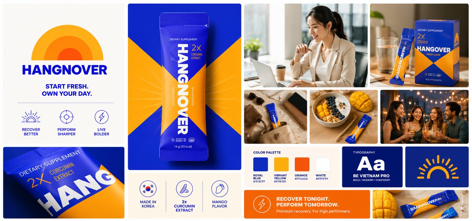
The brand brought to life — bold royal blue and mango-orange, the oversized “NO” device and a lifestyle world built to own the shelf.
The name does the heavy lifting: HangNOver turns the category itself into the brand's biggest asset, and the oversized “NO” device becomes an ownable cue that extends well beyond the wordmark.
The identity centres on a custom sunrise icon — the “O” doubles as a rising sun, signalling recovery, energy and rising above a rough night.
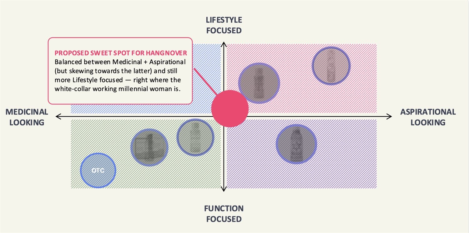
The proposed sweet spot — balanced toward aspirational and lifestyle, right where our target audience lives.
Owns the space between a night out, professional ambition and credible recovery.
“HangNOver” makes the category the hook — with the ownable “NO” as a brand device.
A custom sunrise “O”, a bold wordmark and a cohesive, scalable system.
Royal blue & mango-orange, kept simple — built to own a crowded shelf.
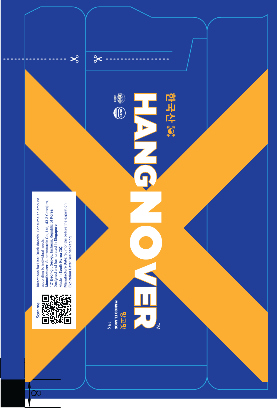
Recovery doesn't have to look medicinal. It can be bright, confident and built for people who refuse to choose between enjoying life and performing at their best.
HangNOver established a unique position between traditional hangover remedies and modern wellness brands — emotional relevance for young professionals seeking both performance and recovery.
The final system stands out in retail while staying premium and credible, with ownable assets built to scale into future products and campaigns.
Owns the space between medicinal remedy and lifestyle wellness — a lane of its own.
Highly visible in a crowded category, while keeping a premium, credible look.
The sunrise mark and “NO” device form a distinctive, memorable system.
A scalable foundation for future product lines and marketing initiatives.
Tell us what you're building — we'll show you how we'd position, name and design it.