 E-Commerce Operations
 Contact Us
Website red flags that are costing you conversions
Traffic is not the problem.
If visitors arrive but don't convert, your website is working against you. More ad spend won't fix a leaking website. Before you increase budget, audit what you already have.
These are the eight conversion killers we find most often — and what to do about each one.
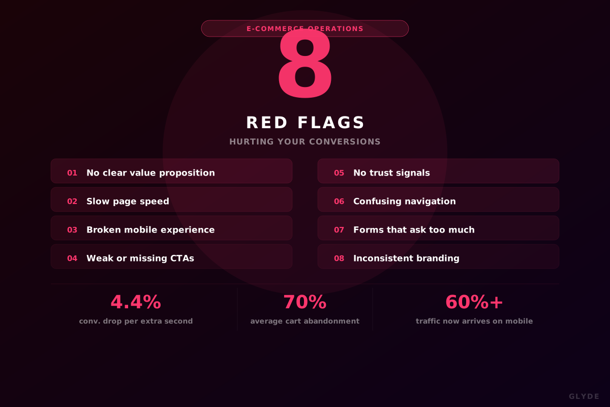
4.4%Conversion drop per extra second of load time
70%Average cart abandonment rate
60%+Of web traffic arrives on mobile
The 8 red flags
What's killing your conversions
01
No clear value proposition above the fold
Visitors ask three things instantly: what is this, is it for me, why choose you? If your hero copy doesn't answer all three in five seconds, they leave.
Who + what + why you
02
Slow page speed
Every extra second costs ~4.4% in conversions. Google also penalises slow sites in rankings. The usual culprits: unoptimised images and bloated third-party scripts.
Target <2.5s load
03
Broken mobile experience
60%+ of traffic is mobile. Tiny buttons, text that needs zooming, and desktop menus on a phone all kill conversions before anyone reads your offer.
Mobile-first design
04
Weak or missing CTAs
"Learn more" and "Submit" are not CTAs — they're placeholders. Every page needs one clear, outcome-driven action visible without scrolling.
1 CTA per page
05
No trust signals
Visitors need proof before they act. Generic stock badges don't cut it. Real client logos, specific testimonials with outcomes, and visible contact info do.
Show real results
06
Confusing navigation
20-item mega-menus help no one. Navigation's job is to get the right visitor to the right page in as few clicks as possible. When in doubt, cut.
Max 5 nav items
07
Forms that ask too much
Removing one form field increases completions by ~11%. At the top of the funnel, ask for the minimum needed to start a conversation — collect the rest later.
3–4 fields max
08
Inconsistent branding
94% of first impressions are design-driven. Fonts that shift between pages, mismatched imagery, and inconsistent tone all erode trust before a visitor reads a word.
Unified brand system
Red flag vs what good looks like
At a glance
| Red flag | What good looks like |
|---|---|
| Vague hero copy | Who + what + why you, above the fold |
| 4+ second load time | Core content visible in <2.5s on mobile |
| Desktop-first layout | Mobile-first, thumb-friendly, fast |
| "Learn more" buttons | Outcome-driven CTA, one per page |
| No social proof | Real testimonials with specific results |
| Mega-menu navigation | 5 clearly labelled primary items |
| 6+ field contact forms | 3–4 fields at top of funnel |
| Inconsistent design | Unified fonts, colours, imagery, voice |
Fix in this order
Priority matters
Not all fixes are equal. Work through this sequence to get the highest impact fastest.
Fix firstSpeed + mobile experienceAffects every visitor
Fix firstValue proposition + CTA clarityAffects every page
Fix nextTrust signals + social proofAffects decisions
Fix nextNavigation simplificationAffects all journeys
Then refineForm optimisationAffects lead capture
Then refineBrand consistency auditAffects credibility
Quick self-audit
Score your own site
Answer these honestly. Three or more "no" answers means you have a conversion problem, not a traffic problem.
- Can a stranger explain what you do within 5 seconds of your homepage?
- Does your site score 85+ on Google PageSpeed for mobile?
- Is your primary CTA visible on every key page without scrolling?
- Does your mobile navigation work cleanly with one thumb?
- Do you have specific client testimonials with measurable outcomes?
- Is your contact form four fields or fewer?
- Are fonts, colours, and imagery consistent across every page?
3+ "no" answers = conversion problem. The fix is your site — not more budget.
The Glyde approach
Design that converts, not just impresses
Every website Glyde builds is designed around one principle: every page has a job, and every element either helps or hinders that job. Positioning drives the message. Visual identity drives the design. Conversion thinking drives the structure.
The Glyde Growth Framework
01
PositionBrand strategy02
DesignVisual identity03
BuildWebsite & assets04
MarketSEO · Ads · Social05
ScaleSustainable growthThink your site has a conversion problem?
Glyde audits and rebuilds websites designed to convert — fixing the issues that quietly cost you customers. Let's look at yours.
Let's talk →