 UI/UX Design
 Contact Us
How good UX directly increases revenue
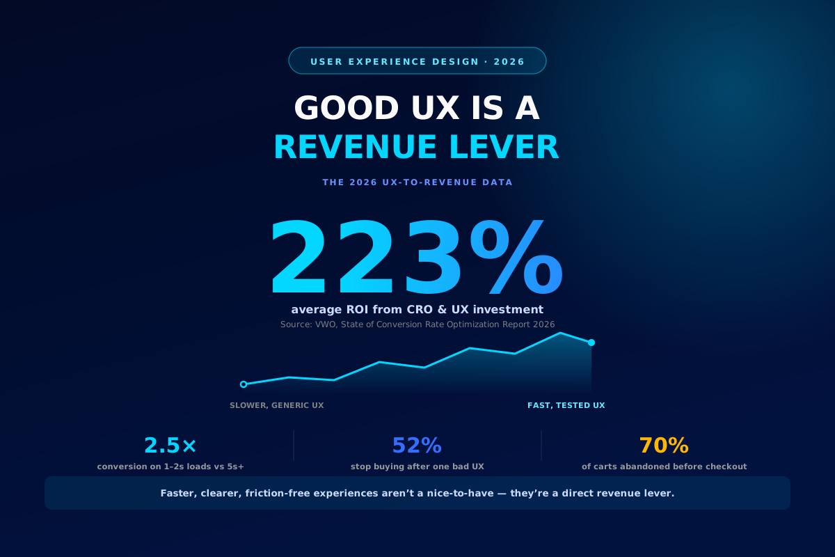
Redesigns used to get pitched as polish. In 2026 the data makes a harder case: every extra second, every confusing step, and every unclear flow is quietly taxing your revenue — and fixing it pays for itself fast.
UX has finally shed its reputation as a "nice to have." Boards fund it, CFOs measure it, and growth teams treat it the same way they treat paid acquisition — as a lever with a calculable return. That shift matters because most businesses are still leaving money on the table in places a chart can show you in seconds: a slow product page, a checkout with one field too many, a support flow that never resolves the first message.
223%average ROI from CRO & UX investment
2.5×higher conversion on 1–2s loads vs 5s+
52%of customers stop buying after one bad experience
None of this is abstract. It shows up directly in the technical layer most teams never audit: whether the site actually performs for the person using it. Core Web Vitals — Google's real-world speed and stability benchmark — is one of the clearest proxies for UX quality at scale, and the 2026 numbers show a wide, revenue-relevant gap between platforms.
Most eCommerce platforms still fail the UX test
% of mobile sites passing all three Core Web Vitals, by platform (2026)
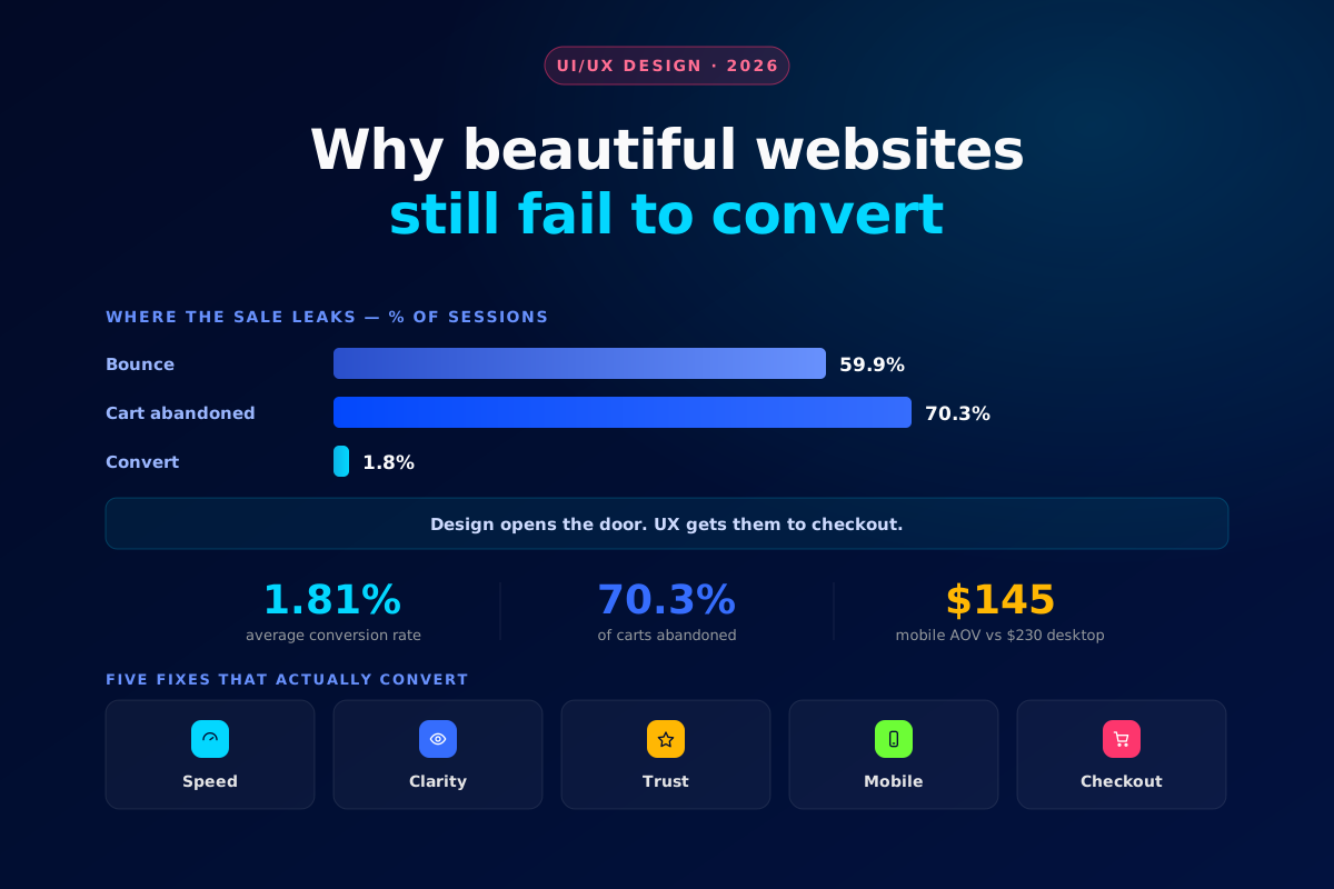
The pattern holds everywhere you look: 70% of carts are abandoned before checkout, and most of that is friction, not price. Every unnecessary step, ambiguous label, or slow-loading page is a small tax collected at the exact moment a customer was ready to pay.
A 1-second load time delivers up to 2.5× the conversion rate of a 5-second load. Speed isn't a technical metric anymore — it's a growth metric.
The process
Diagnose, then prove the lift
The highest-ROI UX work follows a simple order: find where real users get stuck, fix it, then test the fix against the current experience before rolling it out everywhere. Skipping either step is how "redesigns" ship without ever moving the revenue number.
01Find friction, then confirm the fix
1
See where users actually get stuck
Session recordings and heatmaps show the exact click, scroll, or rage-tap that precedes a drop-off — no guesswork required.
Hotjar
2
Test the fix before you commit to it
Run the new flow against the old one with real traffic, and only ship the version that provably converts better.
VWO
Prioritise
Where to start
Your situationStart withWhy
High traffic, flat sales
Session recordings on key pages
Traffic isn't the problem — the flow is
Slow product or landing pages
Core Web Vitals audit
1% conversion lost per 100ms of load time
High cart abandonment
Checkout flow A/B test
70% of carts already leave before paying
Mobile underperforms desktop
Mobile-first UX pass
Desktop still converts roughly 2× better
Do the math on your own site: a 1-percentage-point conversion lift on a $2M-revenue store is worth roughly $20,000 a year. Most UX fixes cost a fraction of that to design and ship.
Where Glyde fits
We design UX as a growth lever, not a facelift
Anyone can make a page look cleaner. The work that moves revenue is different — it starts with real user behaviour, ships as a testable hypothesis, and gets measured against the number that matters. That's the discipline we bring to every UX engagement at Glyde.
The Glyde Growth Framework
01
PositionBrand strategy02
DesignVisual identity03
BuildWebsite & assets04
MarketSEO · Ads · Social05
ScaleSustainable growthWant your website audited for revenue, not just aesthetics?
Glyde runs UX and conversion audits that pinpoint exactly where your site is losing customers — and fixes it.
Get a UX & conversion audit →