 UI/UX Design
 Contact Us
Why beautiful websites still fail to convert
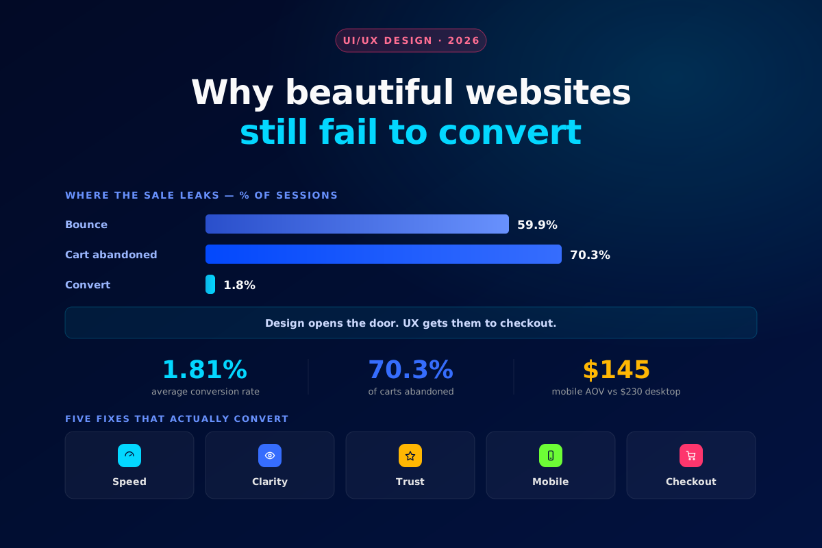
A gorgeous site that doesn't sell is expensive art. Looks win the click; only the experience wins the sale. Here's why beautiful sites underperform — and the fixes that actually move the number.
Design gets people through the door. It rarely gets them to the checkout. The average ecommerce site converts under 2% of its visitors — which means even award-winning storefronts wave goodbye to 98 in 100 people. The gap between "looks great" and "sells well" is almost never aesthetics. It's friction: the small frustrations that pile up between landing and buying.
1.81%average ecommerce conversion rate
59.9%of visitors bounce without acting
70.3%of carts are abandoned
Where good-looking sites lose the sale
Share of sessions, average ecommerce store
The culprits
Six reasons beautiful sites don't convert
1
It loads too slowly
Heavy hero videos and un-optimised images look stunning and kill conversions — every extra second of load time thins the crowd that stays.
2
The value proposition is unclear
If a visitor can't tell what you sell and why it's for them within five seconds, no amount of polish saves the visit.
3
Checkout has friction
Forced accounts, surprise shipping, too many fields — with ~70% of carts abandoned, checkout is where beautiful sites bleed the most.
4
There's no social proof
Reviews, ratings, and real photos do the convincing your copy can't. Without them, a polished page still feels risky to buy from.
5
The mobile experience is an afterthought
Most traffic is mobile, yet mobile order values lag desktop badly. A design that only sings on a 27-inch monitor is losing the majority.
6
The call-to-action is weak or hidden
One clear, repeated, obvious next step beats a beautiful layout where the buy button competes with everything else.
Our toolkit
Tools we use to find the leaks
Hotjar
MS Clarity
VWO
GA4
PageSpeed
Design gets them in the door. Only UX gets them to the checkout. Beauty and conversion aren't the same skill — you need both.
Build your stack
Where to start
Your situationStart withWhy
High traffic, low sales
Audit the checkout
That's where most revenue leaks out
High bounce rate
Fix speed & clarity
You're losing people before they engage
Mobile converts poorly
Rebuild mobile-first
It's where most of your traffic is
Guessing what's wrong
Add heatmaps & A/B tests
Let behaviour, not opinion, decide
Where Glyde fits
We design for the sale, not just the screenshot
A Glyde site is built to look outstanding and convert — because we treat UX, speed, and the buying journey as part of the design brief, not an afterthought. Every layout decision answers to a number, so your site earns its keep instead of just winning compliments.
The Glyde Growth Framework
01
PositionBrand strategy02
DesignVisual identity03
BuildWebsite & assets04
MarketSEO · Ads · Social05
ScaleSustainable growthTurn your site into a conversion engine
Glyde designs sites that look outstanding and sell — UX, speed, and checkout built to convert.
Get a conversion audit →